Airtable Dashboards Provide Valuable Metrics
Airtable blends the features of a database with the format of a spreadsheet, giving business owners the power to know what’s going on in their business by visualizing data in valuable ways.
The organized databases lay the foundation for quick access to custom dashboards displaying real-time metrics and insights.
Some of the 30+ functions available with Airtable’s Blocks feature include:
Map and geocode
Bar, line, and scatter charts
Gantt
Page designer
Org chart

“Bring your workflow to life with Blocks. A creative palette of app-like functionality that you can mix and match to create the perfect workflow for your team.” Airtable
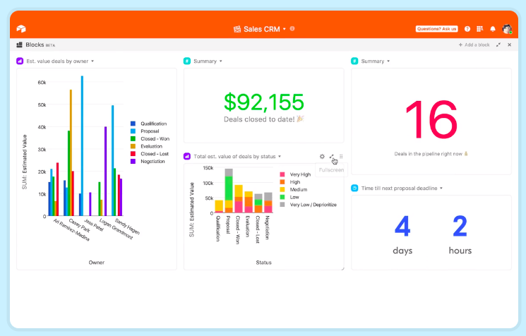
How one client is using Airtable’s dashboard to make smarter decisions
After the databases were organized, and key metrics and KPIs identified, I set-up dashboards giving the client access to information like -
KPIs for a remote team
client timelines from on-boarding to deliverables
response percentages and patterns of contacts
The business owner and teams are using the dashboards to work smarter and to make strategic decisions about clients and employees by -
providing employees with a weekly performance report of their KPIs
reviewing the smartest approach to pitching the thousands of contacts in their database based on tracking historical data including the percent success rate and average response time to inquiries
tracking the number of pitches each employee sends out on a weekly basis
tracking the percentage of pitches that are successful on the initial outreach vs a follow-up
measuring timelines in days or weeks for the on-boarding process and whether clients are on-track for promised deliverables